GTM Buddy Brand & Website Transformation
Led the evolution of GTM Buddy’s visual identity and website, creating a cohesive brand experience across marketing, product, sales, and customer touchpoints.

Category:
Brand Systems · Web Design · Webflow
My Role:
Visual Designer and Webflow Developer
From startup energy to enterprise confidence
GTM Buddy’s previous website used a bold purple theme with bright green accents. While the visual direction captured the energy of a startup, it no longer represented the maturity, credibility, and product depth the company wanted to communicate.
I evolved the brand and website into a lighter, warmer, and more refined experience designed to feel suitable for an enterprise SaaS company. The new direction introduced spacious layouts, cleaner typography, a softer color palette, and a stronger focus on product storytelling.
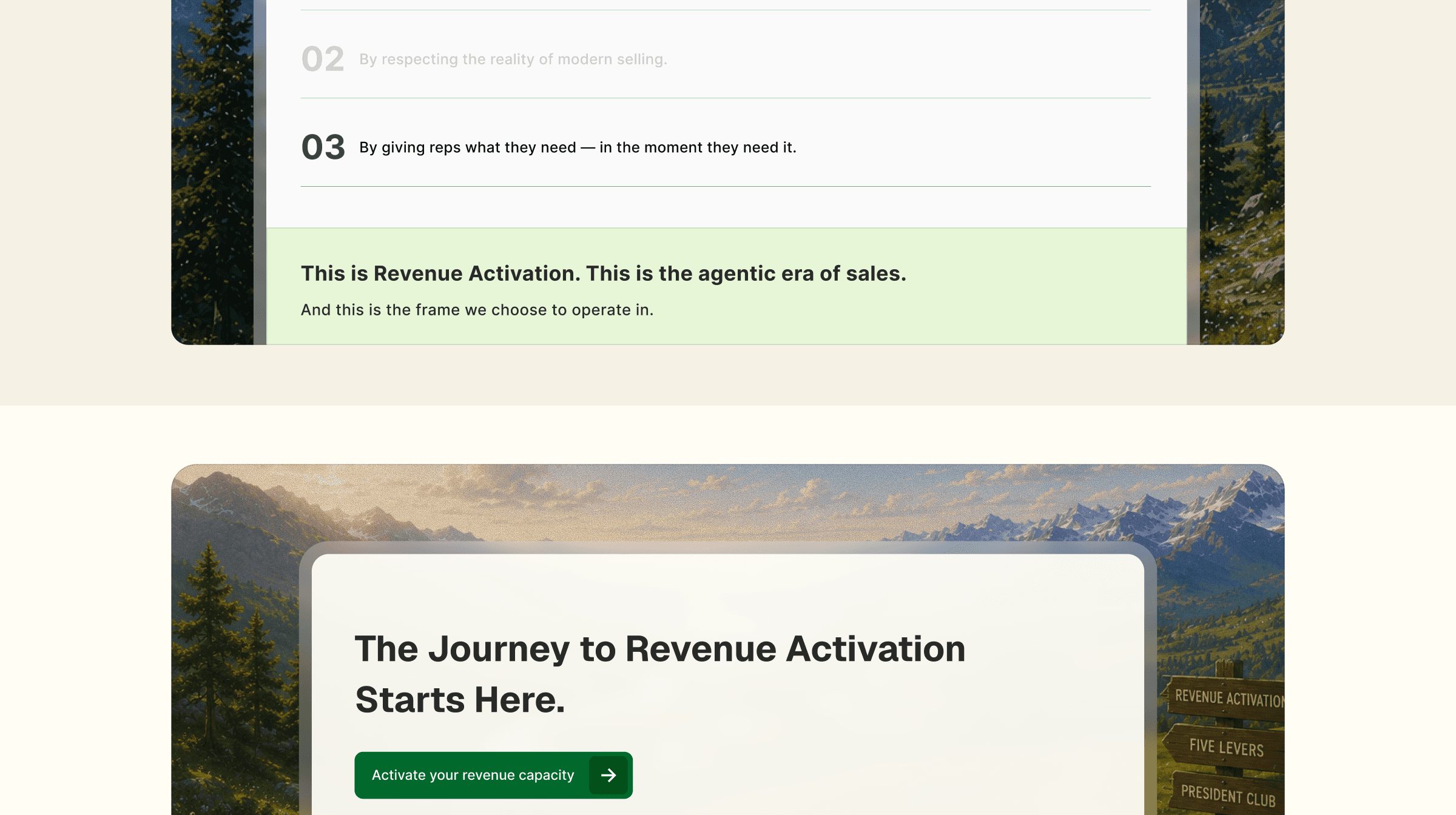
Scenic, painting-inspired imagery was placed behind product screens and videos to create a distinctive sense of warmth and depth. This gave the product a more premium setting while helping GTM Buddy feel established, approachable, and visually memorable.

The visual and layout system
A flexible bento system designed for richer storytelling and seamless responsiveness.
I created a modular bento-style layout system to organize product capabilities, benefits, visuals, and supporting content into clear and engaging groups.
The card-based structure made complex product information easier to scan while giving each section its own visual rhythm. It also allowed the layouts to adapt smoothly across desktop, tablet, and mobile screens.
Reusable patterns helped maintain consistency across the homepage, product pages, campaigns, resources, and conversion journeys. This created a richer visual experience without making the interface feel crowded or difficult to navigate.
Interaction, development, & performance
Built to feel lighter, load faster, and scale better.
I rebuilt the website in Webflow using reusable components and the Client-First structure. Cleaner classes, consistent spacing, and modular components made the website easier to maintain and expand.
Performance was a deliberate part of the transformation. Reducing structural complexity improved loading speed and created a lighter, more responsive experience across devices.
Animated product videos made key capabilities easier to understand without long explanations, improving product clarity. The navigation was also refined with a blurred background behind open dropdowns, reducing distractions and helping visitors focus on their options.
The outcome
The transformation gave GTM Buddy a warmer, more mature, and enterprise-ready presence. Its refined brand language, bento layouts, responsive components, product animations, focused navigation, and faster loading now work together as one consistent system.
The result is a clearer and faster website that supports product communication, campaigns, sales conversations, customer education, and continued brand growth.
Impact
Higher average website engagement time
Faster loading and a smoother responsive experience
Improved product clarity through visual demonstrations
Easier navigation and stronger content focus


