Book a Demo Page Revamp
Redesigning a high-intent page to increase form fills and build a stronger revenue pipeline.
Category:
Conversion Design · UI/UX · Web Design · CRO
My Role:
UX/UI Designer and Webflow Developer
Turning a demo page into a focused conversion experience
The Book a Demo page is one of GTM Buddy’s most important revenue touchpoints. Its purpose is simple: help high-intent visitors understand the value, trust the product, and book a conversation.
The existing page spread this journey across multiple sections and required visitors to scroll, interpret, and reconsider before taking action. I redesigned it as a focused, single-fold experience with clearer messaging, stronger proof, fewer exit points, and a shorter path to the form.
This was not only a visual update. It was a conversion-focused redesign intended to increase qualified form fills and contribute directly to pipeline growth.

Before the redesign
A high-intent page losing attention across too many sections and exit points.
Before the redesign, the page recorded 79 sessions, an average engagement time of 11.7 seconds, and a 50.6% bounce rate. Search Console also showed 739 impressions but only four clicks, resulting in a 0.54% click-through rate.
Visitors were making quick decisions, but the headline, proof, form, and supporting information were distributed across the page. Full navigation, footer links, secondary modules, and lower-page content created unnecessary distractions and possible exit points.
The form received attention, but the business value and customer proof were not concentrated around it. The page was trying to do too much for an experience that needed to support one clear action: booking a demo.

The redesign
One fold, one message, and one clear action.
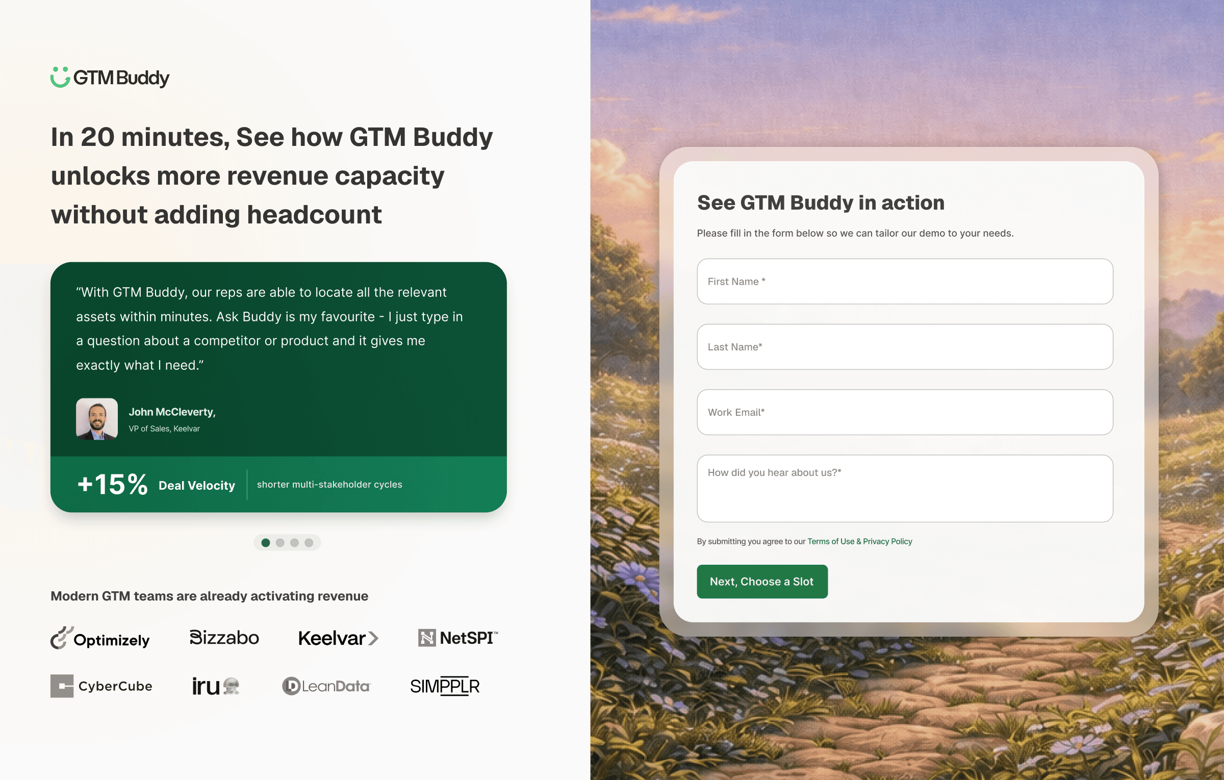
I brought the headline, value proposition, customer proof, and form together within a single fold. A clear left-and-right layout separates the business message from the conversion action, making the page easier to understand and scan.
The full navigation, footer, and unnecessary modules were removed to reduce exits. The form was simplified with email captured first, lowering the initial effort required from visitors.
Customer logos and proof were placed above the fold to build trust before the user reached the form. The warm sunrise artwork created a calmer, more premium experience while keeping the conversion action prominent.
The same visual direction was continued onto the thank-you page, creating a connected experience after submission instead of an abrupt handoff.
The outcome
Following the redesign, form fills increased and the page contributed to building a stronger revenue pipeline. The clearer hierarchy, concentrated proof, and reduced friction helped visitors understand the offer and act with greater confidence.
The project transformed the page from a standard enterprise form experience into a focused, revenue-connected conversion journey.
Impact highlights
Increased demo form fills
Stronger contribution to revenue pipeline
Clearer product value and customer proof
Fewer distractions and exit opportunities
Faster path from interest to action
More consistent demo and thank-you experience


